The Evolution of Clear: From Innovative to Abandoned
Clear was one of the most interesting, innovative, and beautiful to-do list apps around. It used clever swipes and gestures instead of buttons and settings, and it had a colorful panache that you just don’t find in a typical productivity tool. Clear was popular, it was cool, it worked well, and it seemed to have a bright future. That was a decade ago. Back then, co-creator Phill Ryu says, the team stopped working on Clear because it felt… finished, or at least close enough. “It’s so minimalist and simple and charming,” Ryu says now, “it’s not an app where you want to keep adding onto it over the years.” Now, in hindsight, he allows that there was another factor as well. “I think we were all a little burned out.” After years of building and polishing this unusual app, porting it to new platforms and standing up a stable syncing system, Ryu and his colleagues just didn’t want to deal anymore. Clear has been available and surprisingly functional ever since but seemed to be mostly abandoned.
Clear 2: A Revamped and Ambitious Take on the Original
Now, Clear is back. Ryu and his colleagues at Impending (which is also the company behind the mega-popular Heads Up! game) are launching Clear 2 today for the iPhone and iPad after buying the rights to the app from its original partners at Realmac Software and spending the last couple of years tweaking and polishing the app all over again. The new Clear doesn’t yet sync across devices — though Ryu says that’ll come — and it’ll almost certainly never have a Mac app. Ryu says he just can’t figure out how to make a Mac app that feels good the way Clear feels good. But in other ways, it’s an even more ambitious take on the things that made Clear special in the first place.
The Beauty of Clear: A Delightful and Personal App
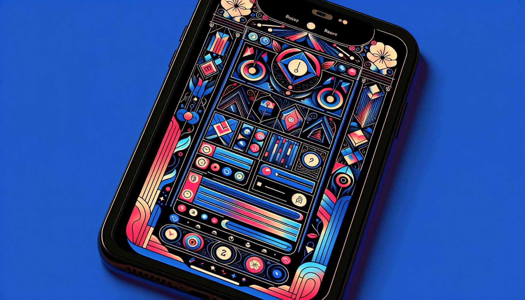
The basic Clear structure is the same as it ever was. The app is just a list of lists — you tap on a list to open it, pinch to close it, swipe to complete or schedule an item, and press and hold to drag things around. I’ve been using it in beta for months, and it is every bit as fun to use as before. The animations are beautiful and fast, and Clear 2 has the same whimsical gradient colors that made the original so nice to look at. If you’ve been using Clear happily for a decade, as Ryu says tens of thousands of people have, the new version will take some getting used to, but it’s a nice update.
You can certainly use Clear to make to-do lists — you can set a reminder on any item, which is handy — but it’s really not a task manager app like Todoist or Things. Those apps have tags and recurrences and projects and big ideas about getting things done. Clear, Ryu says, is instead meant to simply be a private place for your thoughts. “I feel like thoughts deserve a beautiful vessel,” he says, “and we really go out of our way to make Clear a beautiful vessel, not just visually or aesthetically but to feel satisfying to fill up.” The app itself suggests you use it for making a gratitude list, ranking your favorite Pixar movies, keeping a dream diary, and more.
The Monetization Plan: Personalization and User Support
When Ryu and I first talked about Clear 2, he was planning to turn Clear into a subscription app. That’s the business now, really: give people a free tool to start, then try and hook them with additional features and get them to pay every month. But since then, Ryu has changed his mind. Clear 2 is a free app. The monetization plan is all about personalization: Ryu and Impending are planning a steady release of new themes, new fonts, new icons, new in-app sounds, new everything, in the hopes that users might pay for stuff they like and support the app that way.
That personalization is really the most important new thing about Clear 2. It’s an app with hundreds of different styles and use cases, which Ryu hopes people will adapt to their own preferences. There’s not enough of that in the world these days, he thinks. “There’s occasionally even a lack of a human touch from Apple sometimes,” he says. “And you know, all Disney blockbusters, every show kind of looks like an HBO prestige show…” There’s just a sameness to it all, he says. “I think there’s a sense that we’re ready for more fresh, interesting spaces again.”
Clear 2: Not for Everyone, But a Private and Delightful Tool
Ryu doesn’t seem at all certain this will work, though. Sure, Fortnite makes a lot of money selling skins, but can Clear sell enough custom icons to sustain itself? He hopes so, and he likes what it means for the app. “We can give fans some fun, new things throughout the year, and it’s not going to complicate the silhouette of the app,” he says. The content-first strategy does require Impending to keep making new things, but that’s not what he’s worried about; he’s worried about making new things that make Clear worse just to keep making new things.
Clear 2 won’t be for everybody. A decade after the first app wowed everyone with its design chops, it’s no longer so novel to see fun icons and smooth animations. (Though it’s still more rare than it should be, especially in productivity apps.) A few existing Clear users might be turned off by the changes or the lack of cross-device sync. But Ryu is confident that people need a private, personal, delightful place on their phones and that Clear might just be it.
Analyst comment
Positive news: Clear is back with a revamped version, Clear 2, which retains the same delightful and personal app experience. The app has beautiful animations and colors, making it a visually pleasing tool. The monetization plan involves personalization options for users to pay for. While it may not be for everyone, Clear 2 aims to provide a private and satisfying place for users’ thoughts.
As an analyst, the market can expect a positive response to Clear 2 with its loyal user base. The app’s focus on personalization and its unique user experience are likely to attract new users as well. The monetization through personalization options may generate revenue and support the app’s future development.


